Dennis Brotzky Front End Developer

I am a Front End Developer living in Vancouver working at Grow. I am interested in web apps, design, and general user experience. I enjoy designing and developing appplications that are user focused.

I am an advocate of React and have quickly found myself engulfed in the ecosystem around it. Feel free to contact me here or through any of my social channels if you'd like to talk about any Front End related topics.

This portfolio is hosted on a Linode Server with the domain purchased from Namecheap. This site is web optimized through Google Developer tools / Page Speed Insights and other tools.
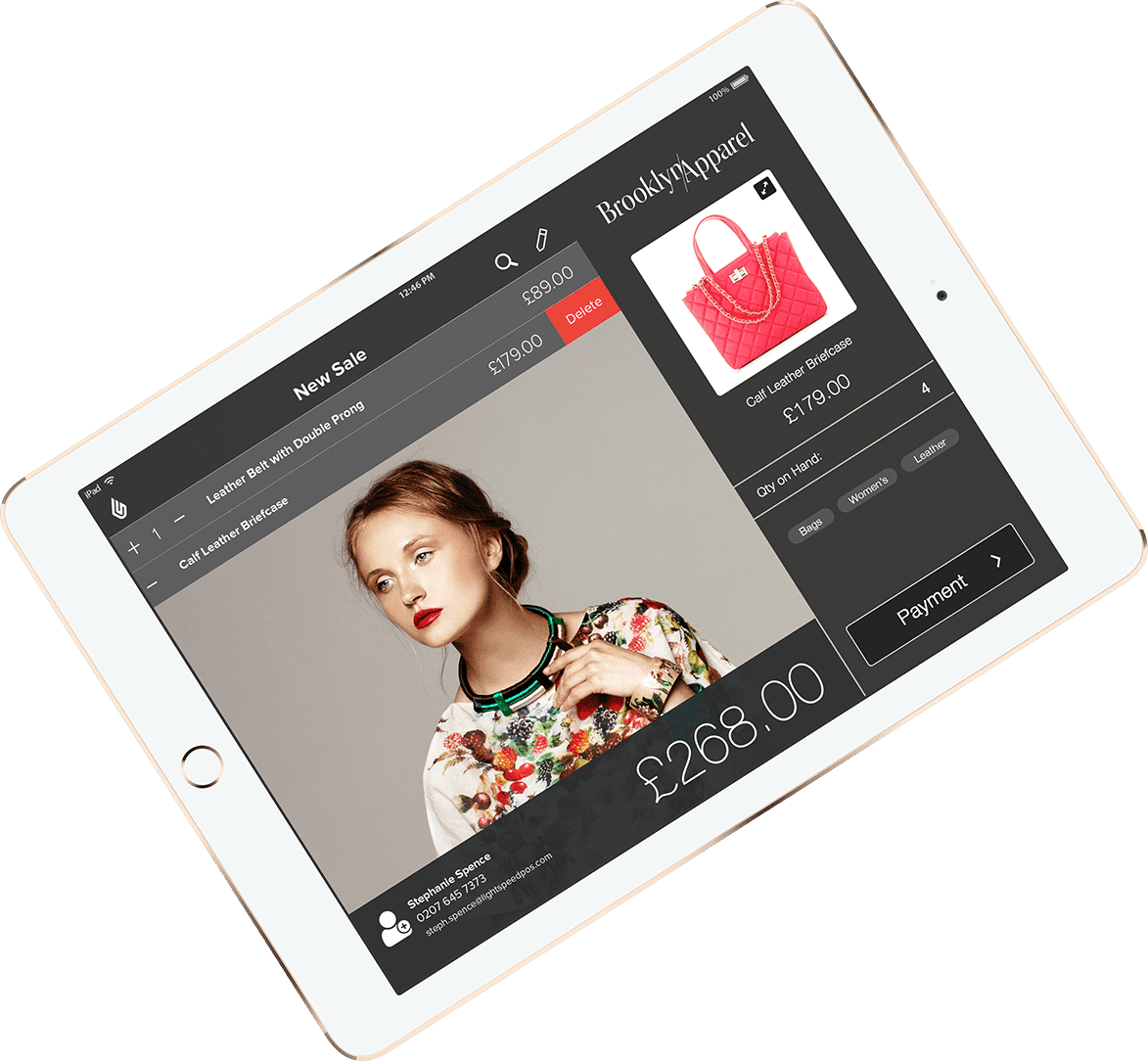

  • Developed a completely modular CMS that allows all team members to create, edit, and publish new pages. This website is available in 5 langauges and 9 domains.
  • Chosen to redevelop highest trafficked page. Process included extensive research, collaboration, development, and testing.
  • In charge of website performance - file structing, loading assets, image optimization, and more.
  • Go to developer for animations, interactions, design implementations, and SVGs.
  • Advocate of data tracking, A/B testing, and real time personalization.
Apple iMac with Website Displayed.
McGill Racing Team App Single Page App

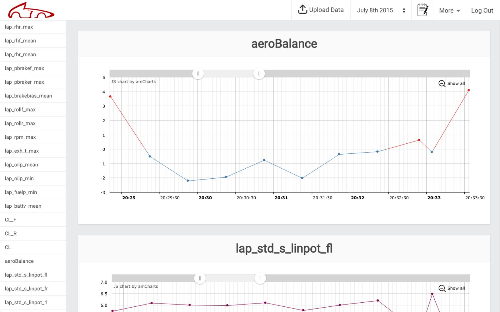
A web application developed for the McGill Racing Team to give the entire team access to their racing and testing data. The data is collected by Simulation Engineers and uploaded to the application via JSON or CSV file formats. The application renders the data and stores it for future use.

Features a Firebase backend that allows for notes, file uploading, and login authorization. The charts are built with Amcharts JavaScript Charts and Maps.

View Live App

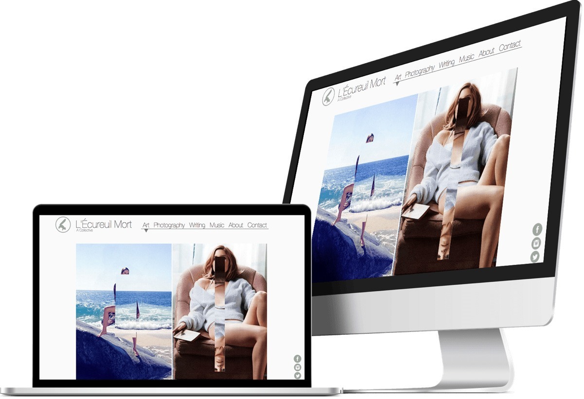
Apple Devices displaying Ecureuil Mort Website
L'Écureuil Mort Art Blog · Lead Developer

L'Écureuil Mort is a project run by Ronald Yang and myself that showcases art, photography, music, and writing. I developed the website and help curate the content that is updated every few days. The website was one of the first I made, which forced me to learn content management, responsive design, website deployment, web optimization, file structuring, and SEO basics. The L'Écureuil Mort project is constantly evolving and is a great outlet for creatively.

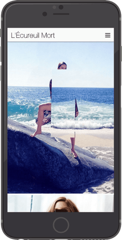
Apple iPhone holder for video.

The design is focused solely on presenting the content as cleanly as possible. This meant stripping away everything that wasn't needed and letting the art speak for itself. One of our main priorities was to make sure the moble experience was as good, if not better, than the desktop version of the website.

When scaled down, images take up the width of the viewport and the navigation becomes fixed to the top. We tried various iterations with image size and navigation placement, but the visuals worked best when presented at full scale.

View Live Website

Interests A little about me

Professional: learning, teaching, web applications, web design, web performance, data tracking / AB Testing, UI/UX Design, animation / interaction design, and creative thinking.

Personal: drinks and food with friends, soccer, ramen, music, coffee, and the occasional nap.

† This background image is scanned from one of my records by Will & Florian.

3D CSS Drawing XYZ, Animation, Transform

Hover Robot ⇛

I've always enjoyed making CSS drawings to help myself learn everything there is to know about the Box Model, positioning, border-radius, and more. I decided to implement the same technique but make it 3D as a challenge. This would force me to understand CSS transforms, perspective, and the animation property.

During the beginning I had trouble grasping the three dimensional planes and how to move objects around them. By the end, I had a strong grasp over the rotation and movement of objects in the X, Y, and Z planes. Also, I now fully understand the perspective property along with the animation property. If you haven't already, hover of the Robot while it is rendered in 3D to reveal what is inside.

<form>
</form>
Forms Fully Responsive & Interactive

Nobody likes to fill out web forms when they're browsing through websites. I started this project to grasp every detail of web forms through practice and creativity. It is a way for me to create forms that are aesthetically pleasing while trying to lower bounce rates and come up with new CSS tricks.

Each form is interactive and unique from the rest. They all have a similar HTML skeleton, but vastly different CSS. The styling ranges from Material Design to simple Flat Design.

View Project

McGill University B.A. Psychology / Music Technology

I attended McGill University from 2010-2014 where I majored in Psychology and minored in Musical Applications of Technology. Psychology has always intrigued me since I have always wondered why people do things, what motivates them, and how the brain functions.

My first exposure to web development was through MUMT 301, Music and the Internet. We had a competition to see who could build the best website for bonus credits and the professor said to take a few hours on it - I spent 5 days. The following semester, I took COMP 202, Foundations of Programming , which covered Java and Object Oriented Programming.

† McGill Oil Painting used with permission from Pim Sekeris.

Get in touch brotzky@gmail.com

placeholder